Branding & Website · Studio
Horricks Law
An identity and website for a law firm that had to read as strength and trust.

The problem
Horricks Law Corporation needed an identity that telegraphed strength, professionalism, and trust the moment a prospective client encountered it — and a website that backed the brand up with clarity about services, practice areas, and the team behind them.
What we did
Clean, modern typography and a balanced mark carry authority without stiffness. Deep tones convey reliability while subtle accents add sophistication. The mark holds up in both digital and print, and the website translates that same clarity into a client-focused experience across every device.
Logo Design
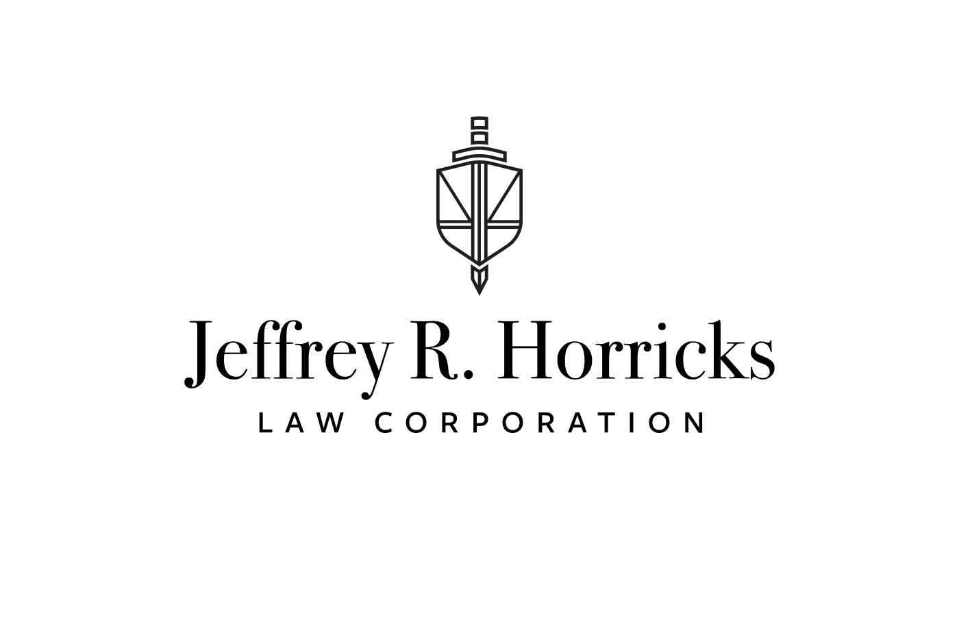
The mark for Horricks Law Corporation incorporates imagery symbolising Justice, Protection, and Honour. Balanced scales subtly reference justice; strong, protective shapes evoke security and trust. Simple, memorable, and versatile enough to hold across mediums.
Brand System
The system extends the logo’s authority into a broader toolkit: colour, type, and supporting marks tuned to feel precise and professional. Deep tones anchor the palette; subtle accents keep the brand from reading cold.

Client Website
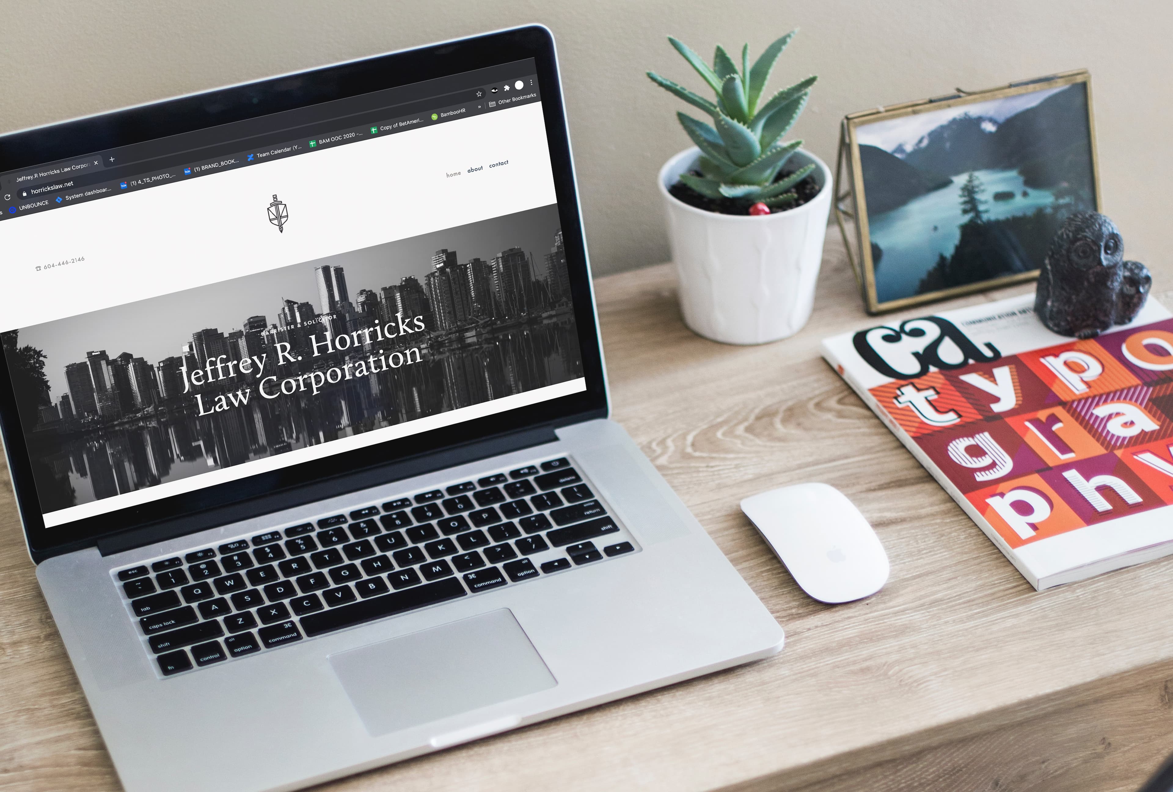
The Horricks Law site highlights the firm’s professionalism and expertise with a clean, modern layout. Navigation makes practice areas, services, and team details easy to find. Subtle justice-themed visuals reinforce trust, and a responsive design carries that experience across every device.